

Forms are one of the most powerful tools any website can offer, whether you’re gathering email newsletter signups or work inquiries from potential clients. Form Builder is a plugin that allows you to build different types of custom forms which your visitors can use to get in touch with you and using that form you can send necessary information also, It helps you to customize your form to the exact specifications that you desire.
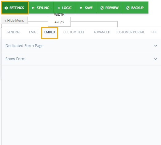
Setting
All settings are customized. Anyone can set them up according to their requirements, Some settings apply to the entire form. These setting can be accessed with the “Settings” wrench icon on the top left of Form Builder. The Settings is used initially when creating a new form. It has different fields which helps in creating a form. The fields are explained as follows.
General
Every field is pretty self explanatory. Here are fields that general setting has which gives you privileges to enable or disable fields i.e
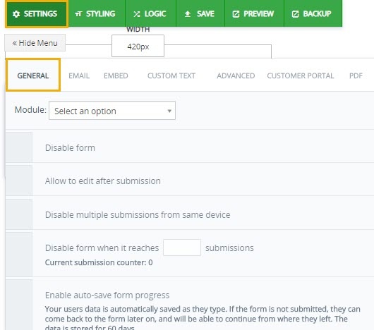
Module- selects the path for form.
Disable Form– Disable access to the form.
Allows to edit after submission– Allows to make change once form is submitted
Disable multiple submission from same device– Disable multiple submission from same device if enabled.
Disable Submission counter– Disable submission when it reaches to user defined count.
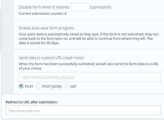
Enable Auto save– Enables to save the form automatically.
Send data to custom URL– This feature acts like a webhook, and allows you to send the form data in a structured format to another URL, which could be on another site. This is not the same as redirecting the user to another URL.
Redirect to URL after submission– After submitting form URL of page as home page.
A form submission would typically send two types of emails. A notification email to a list of recipients, and an auto-responder / thank you email to the user who filled the form. The content and subject of both emails is highly customizable.
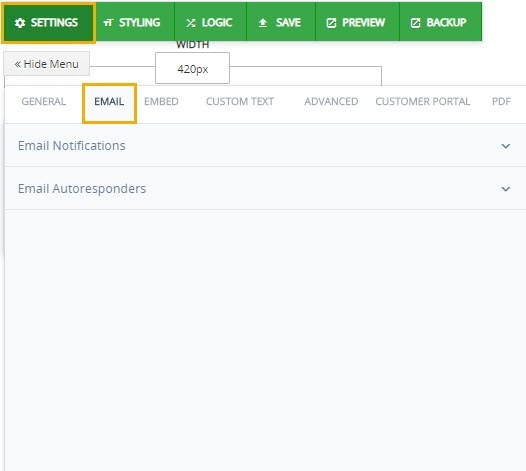
Email Notification- It allows you send form in email. It requires three fields which needs to be filled before sending. Senders Email, Email Body and Email Subject.
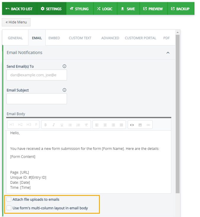
Attach file uploads to emails- Enabling this box will send all the documents uploaded to the form as an attachment in email.
Use form’s multi-column layout in email body– Enabling this box will present the data in the email in form’s multi-column layout.
Email Autoresponders– Allows you to send autoresponders or thank you email to users who fill the form. First, add an email field to your form. Click on the field to edit it, and check the optionSend Autoresponder. Click on the configure link to edit the content of this autoresponder email. Here, you can edit the Sender Name and Sender Email, as well as Subject and Email Body of the autoresponder. You can use form values in any of these fields
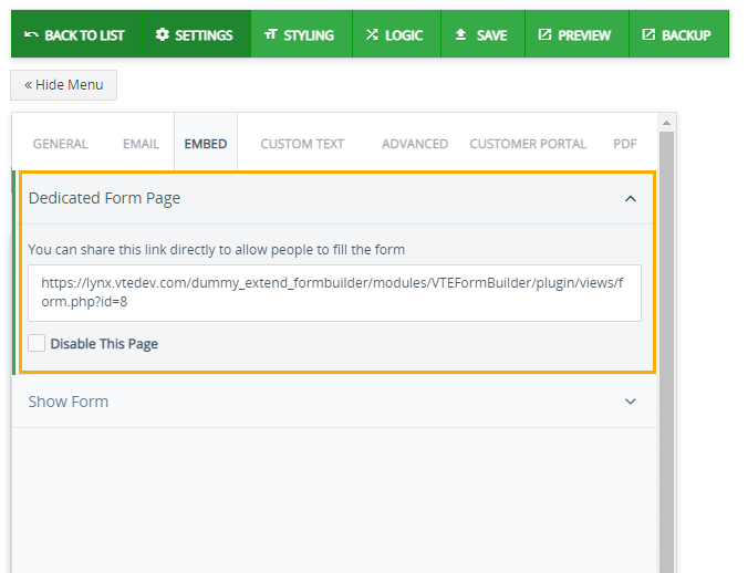
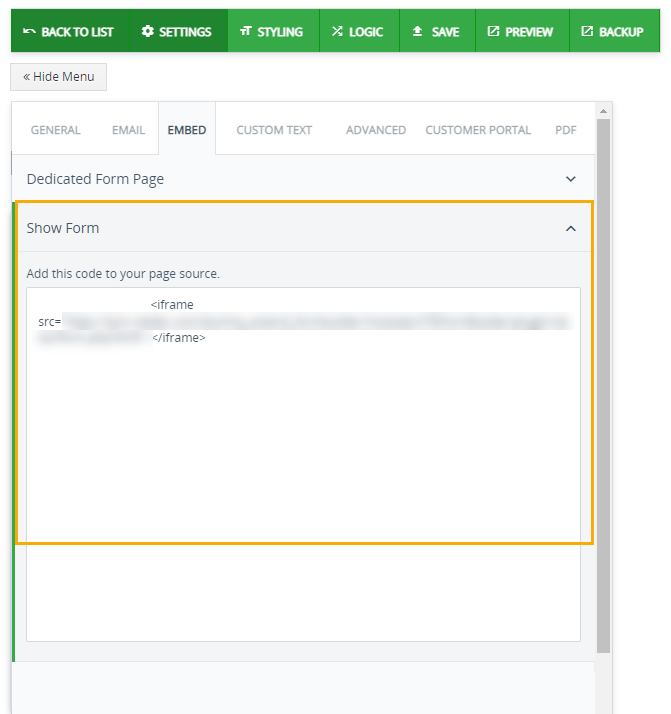
Embed
Forms can be shared in two ways on your page.
Dedicated Form Page – You can share this link of the form directly to allow people to fill the form
Show Form– In show form source code can be added so that form can be customized through source code. It basically external features into your form builder.
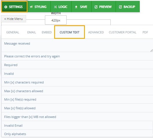
Custom Text
You can put customized text for error messages or success messages. An error message alerts users of a problem that has already occurred. By contrast, a warning message alerts users of a condition that might cause a problem in the future. Effective error messages inform users that a problem occurred, explain why it happened, and provide a solution so users can fix the problem. Vice versa intent of this success messages is to make users aware of important changes in content that are not given focus, and to do so in a way that doesn’t unnecessarily interrupt their work. So while building a well designed form its very important to keep up with all the little details.
Advanced
This involves advance setting which help you to build your form here are the following fields discussed below which helps you to make your form interactive. i.e
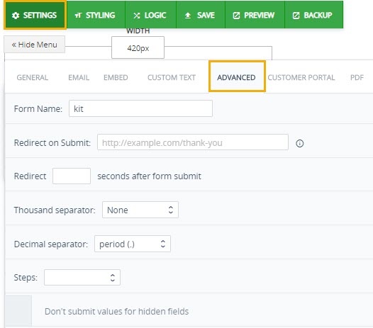
Form Name– A suitable name to give form.
Redirect on submit– Redirect to URL after submitting form. URL can be filled in given field.
Redirect– Redirect after how many seconds. In given blank field enter seconds how many seconds after you want to redirect the URL mentioned above.
Thousand Separator– Symbol to separate digits when the amount reaches to thousand calls Thousand Separator e.g 1,000,000
Decimal Separator– A decimal separator is a symbol used to separate the integer part from the fractional part of a number written in decimal form. e.g 12 345 678,9. breaking spaces
Steps– decides
Don’t submit values for hidden fields– if checked it doesn’t submit values which are hidden at first placed.
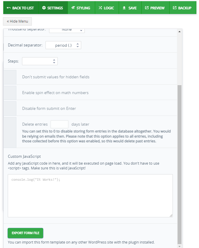
Enable spin effect on math number– Enables number to rotate in some specific position.
Disable form submit on Enter– disables form on entering submit button.
Custom JavaScript– JavaScript is one of the easiest, versatile and effective languages used to extend functionality in websites Customized javaScript code user can place in this field. The Custom Elements API elements can inherit from native HTML elements or other Custom elements, and they can be extended with new properties and methods. They can also overwrite a set of methods – defined in the spec – which hook into their life cycle.
Delete Entries– You can set this to 0 to disable storing form entries in the database altogether. You would be relying on emails then. Please note that this option applies to all entries, including those collected before this option was enabled, so this would delete past entries.
Customer Portal
Its a private, secure platform that enables businesses to share account-specific information with called Customer Portal. Users can share tickets, forms, invoices, assets, product details and order information, calendars, etc. While it also allow users to easily search, enter, edit and view documents.
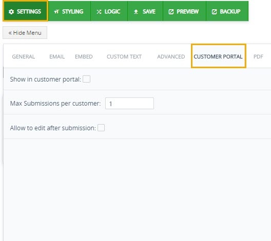
Show in Customer portal– It allows forms appear in Customer Portal.
Max Submissions per customer– Max number of submission per user.
Allow to edit after Submission- allows to edit after submitting.
With this feature you can attach a PDF file of the form with an email. It comes with styling tools to make it look more appealing. Which includes PDF Author Name, PDF title, PDF title, font type and its size, header and footer fields, also include images, Multi column for PDF etc
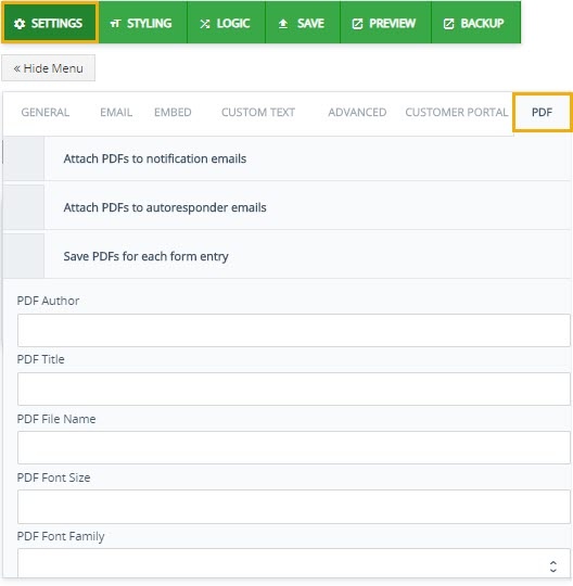
Attach PDF to notification Email– It attachs PDF file of the form with form which can be further sent to an email address.
Attach PDF to Autoesponders Email– Automatically attach PDF of form with series of email. It helps when you need to send a form to bunch of people at once.
Save PDF for each entry– Saves PDF at click. When enables automatically saves each PDF file into PC.
PDF Author– PDF require authors name who initially made the form. So Field that should be filled in order to proceed forward.
PDF title– Title of the PDF.
PDF file name– Name of PDF file entitled by PDF author.
PDF font size– PDF requires a font size how the document form of a form should be sent so in order to make your document look appealing standard size is choosen.
PDF font family– Fonts in your pdf file allows anyone who opens your file to see the document as you intended.
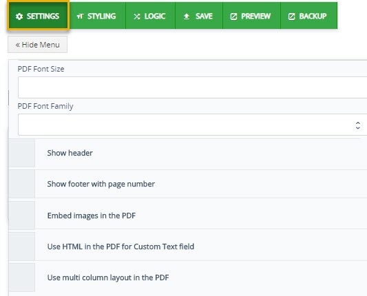
Show Header & Footer- The Header & Footer tool lets you insert text, images, and other PDF files into one or more pages in a PDF document. You have full control over the position, size, opacity, and other properties of your headers and footers, and you can save them for reuse.
Embed images in PDF-You can embed different sort of images in pdf.
Use HTML in PDF of Custom Text field– You can select in HTML the fields you want to be converted to PDF form fields using the special attribute. The other HTML fields which were not explicitly selected will not be converted to PDF form fields.
Multi column for PDF– Multi column fields can add in PDF. User can add anything to meet desires.
Styling
This feature allows to use your own cascading style sheet (CSS) to customize the look of your form builder. Styling forms with CSS is a great opportunity to add company’s brand on the form, not to mention it offers a lot of flexibility during creation.
General
To add Custom CSS styling or customized font and page styling or put a watermark onto your form general styling will help you make your document more appealing.
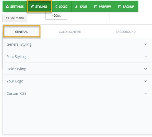
- General Styling– It involves styling to be removed from borders and fields styling will remain inside of the form and wont disturb the field or border line. Also it has icon to hide the styling blocks. if enables will hide all the styling block.
- Font Styling– Font styling decides the font type and its size. There are different type of font available in drop down menu font or text size is how large the characters displayed on a screen or printed on a page are
- Field Styling– You can customized field layout and field alignment Layout & Alignment properties can be set in two places at the form level and at the field level. Settings made at the form level apply to all elements within the form, except for those elements to which you apply element-level changes
- Your Logo– Logo can be customized. Upload any picture of your logo. It can be used as watermark.
- Custom CSS– You can customized your page with custom CSS(cascaded styling sheet).
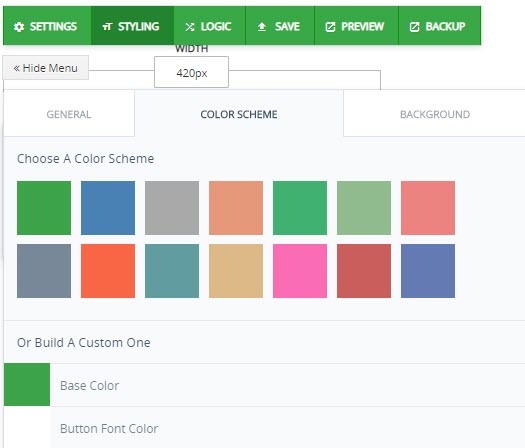
Color Scheme
It allows users to customize the colors used in a form. A color selection screen is available for Base color, button font color, pagination button color, general font color, field font color. To customize the color of a visual component in Forms, click the corresponding button of the object to change the color of and click on one of the color cells.
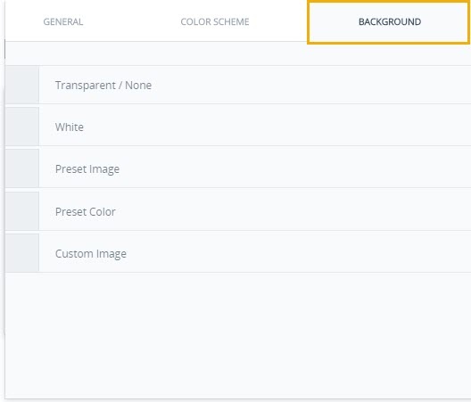
Background
The form background image can be linked, uploaded from your computer or transparent. Use the color picker to select the color of your liking or type the RGBA or Hex color codes. This helps in a way say you may sometimes want to customize the style of your forms. This may be because you want the forms to match the rest of your website, or because you want a form to stand out on a web page.
Preview
Before you print/submitting a document, it is important to make sure that it will be printed the way you want it. Previewing a document enables you to see exactly the way the pages will appear when printed, and where necessary, make any changes to the document. Previewing allows you to see exactly how the document will appear when printed.
Backup
Backup refers to the process of storing data in another separate medium and not just in the primary storage. This helps you recover data in case the primary hardware fails or is stolen. One of the greatest things about backing up data is the ease at which you are able to retrieve files and information. When you back up data, you have the ability to access specific files in seconds.
Add Fields
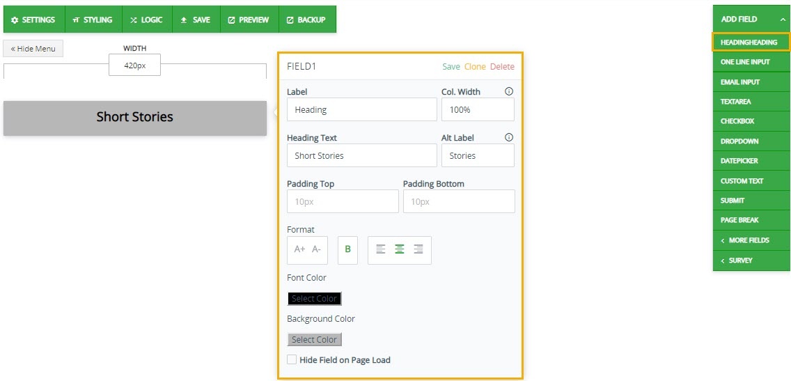
Heading
A heading is a word, phrase, or sentence at the beginning of a written passage that explains what it’s about. A heading is very similar to a title. Which typically uses to give definition to your layout.
- Label- A label can communicate to users what content is about. A label can be used to describe an attribute.
- Col Width– It allows you resize column width the text, meaning each column will be sized according to mention percentage.
- Heading Text– Heading Text is content that will appear onto your Heading.
- Padding– Padding is the space that’s inside the element between the element and the border. Padding goes around all four sides of the content and you can target and change the padding for each side with CSS.
- Format– Format is an arrangement for something written how text is arranged in a document.
- Font Color– Users can select various color contrast profiles such as light, dark, inverted and monochrome
- Background Color– The background color CSS property sets the background color of an element.
- Hide Field on Page Load– Lastly page ‘Hide Field on Page Load” which disable heading when you load page.
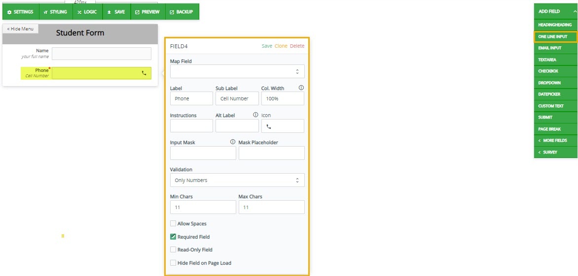
One line Input
Input text is text the user has entered into a text field.Input text is text entered by the user. Input text is text the user has entered into a text field. User can customized its appearence its font color, font size, col width, icon which can just be a person or thing regarded a a representative symbol, min max characters, allow spaces which allow users to add spaces in digits, required field and lastly read only checkbox.
- Icon– icon which can just be a person or thing regarded as a representative symbol
- Map Field– To map form fields with Contact fields, make sure the contact mapping within the Contact integration.
- Input Mask– An input mask refers to a string expression, defined by a developer, that constrains user input. Some frequent uses of input masks include entry of telephone numbers, ZIP or postal codes, times and dates.
- Mask Placeholder– It allows a user to more easily enter fixed width input where you would like them to enter the data in a certain format (dates,phone numbers, etc).
- Validation– Something, such as a certificate, that validates something. The process whereby others confirm the validity of something such as numbers, alphabets.
- Read Only Field– Disable editing for users. Allows them to read the document only.
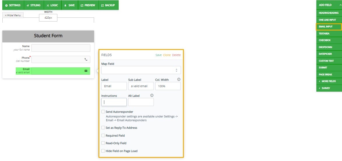
Email Input
This input used to let the user enter an e-mail address.
- Sub Label– Sub label is subordinate to the documents’s main label.
- Alt label– Which is used when we send data via web hook
- Send Autoresponders– Send Autoresponder is a computer program that automatically answers e-mail sent to it. They can be very simple or quite complex. The first autoresponders were created within mail transfer agents that found they could not deliver an e-mail to a given address. If you check
- Set as Reply-To-Address– Set as Reply-To-Address it will automatically send confirmation email to that email address.
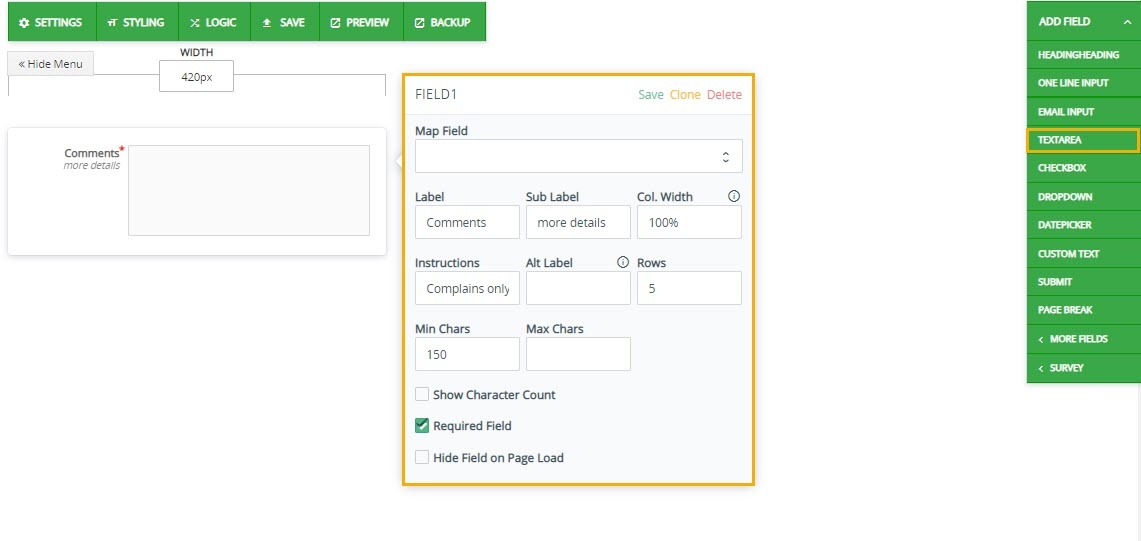
Text Area
Proper use of commenting can make code maintenance much easier, as well as helping make finding bugs faster. Further, commenting is very important when writing functions that other people will use.
- Instruction– Instruction are basically how you want to your comments to be whether its complain box or other comments regarding form.
- Character Count– Character Count counter tool that provides instant character count & word count statistics for a given text. The tool reports the number of character with spaces and without spaces, also the number of words and sentences. This checkbox enables character count.
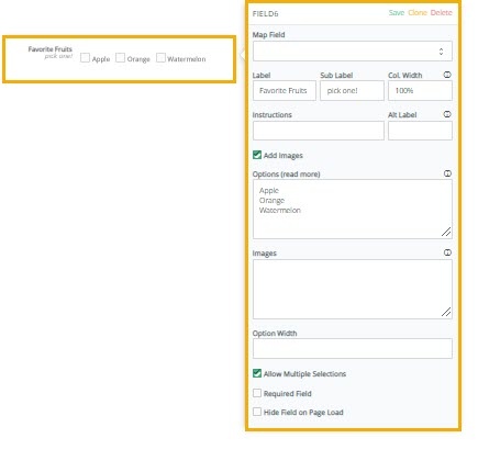
Check Box
A checkbox is a GUI widget that permits the user to make a binary choice, i.e. a choice between one of two possible mutually exclusive options. For example, the user may have to answer ‘yes’ (checked) or ‘no’ (not checked) on a simple yes/no question.
- Options– Multi choice option. User can select one option or multiple options according to question it can be set through allow multiple selection.
- Option Width– Option width identifies individual check size option.
- Allow multiple Selection– Allows user to select multiple option in one time.
Date Picker/Time picker
A date picker, popup calendar, date and time picker, or time picker is a graphical user interface widget that allows the user to select a date from a calendar and/or time from a time range. The date picker provides several advantages, including allowing the user to enter a date by merely clicking on a date in the pop-up calendar as opposed to having to take their hand off the mouse to type in a date.
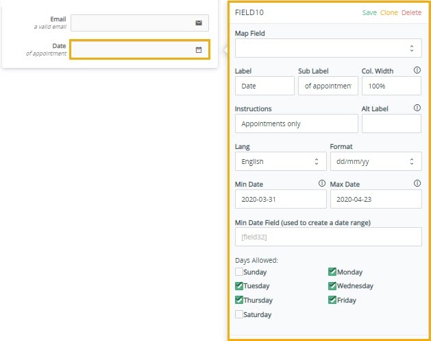
- Format– The legal and cultural expectations for date representation vary which depends upon countries. You can choose any format.
- Lang– Short form of language which can be differ.
- Min Date/Max Date– The min attribute together with the max attribute to create a range of legal date/time values
- Date Range– this field requires range of period
Custom Text
Custom Text allows you to change your form’s built-in labels and messages. You can use this to fully translate your form into a different language or to fine-tune labels and messages for specific situations.
- Position– An element with position: fixed; is positioned relative to the view point, which means it always stays in the same place even if the page is scrolled. The top, right, bottom, and left properties are used to position the element
- Inline/Overlap– The initial value for the display property on a link is display inline. This means that it will try to fit in with the text and will accept horizontal margins, and padding on all sides, which is exactly why your link overlaps the text.
- Text Content– Content is the stuff people see in the browser. We use HTML to organize that content into familiar element type like headings, lists, and paragraphs. The image below represents a document. The words and pictures are content. The red labels indicate the element type of each bit of content

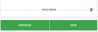
Page Break
A page break is a marker in an electronic document that tells the document interpreter that the content which follows is part of a new page. A page break causes a form feed to be sent to the printer during spooling of the document to the printer. Thus it is one of the elements that contributes to pagination. It allows to go onto next or previous page.
Other Fields
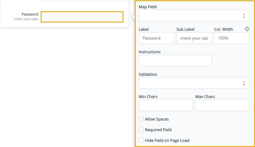
Password
A password, sometimes called a pass code, is a memorized secret, typically a string of characters, used to confirm the identity of a user.
- Instructions– Meet password requirements Create your password using 8 characters or more. These can be input for instructions.
- validation– it requires different fields you can set it only numbers or only alphabets or both. It can be any combination of letters, numbers, and symbols Accents and accented characters aren’t supported. You can’t use a password that: Is particularly weak.
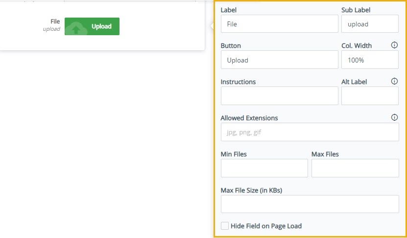
File Upload
Uploading is the process of putting web pages, images and files onto a web server.
- Allowed Extension– Users often ask which file types are supported in the File Upload field. The default file extensions are pdf, doc, docx, xls, xlsx, csv, txt, rtf, html, zip, mp3, wma, mpg, flv, avi, jpg, jpeg, png, gif.
- Max size– By default, the maximum upload size in WordPress ranges from 2MB to 150MB. You can upload file in between.
Slider
A slider is horizontal and has a single handle that can be moved with the mouse or by using the arrow keys. Add a range slider widget for your forms. Range Slider engages the user in an interactive and easy way of selecting a range of values.
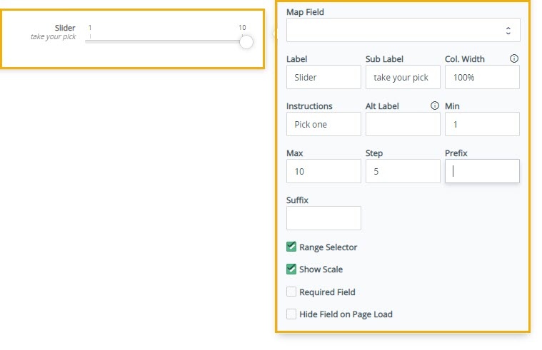
- Prefix– Prefix is a group of letters that comes at the stating of a root word.
- Suffix– Suffix is a group of letters that is added at the end of a base word
- Range Selector– The range selector is a tool for selecting ranges to display within the chart. It provides buttons to select pre-configured ranges in the slider. It also provides input boxes where min and max dates can be manually input.
- Show Scale– Enabling this button will shows range on the scale.
Address
Address is basically the number of the house, name of the road, and name of the town where a person lives or works. In form builder we provide this feature where user can input his/her address into a given address field
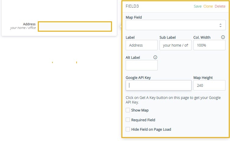
- Google Api Key– An application programming interface key is a unique identifier used to authenticate a user, developer, or calling program to an API. However, they are typically used to authenticate a project with the API rather than a human user. Different platforms may implement and use API keys in different ways. API keys are useful in clients such as browser and mobile applications that don’t have a backend server. The API key is used to track API requests associated with your project for quota and billing.
Signature
The signature is the most common way to indicate that you have read and agreed to a contract, even if one’s signature is so unique and stylized as to be virtually illegible. Also, as contracts continue to move into paperless electronic formats, the criteria for what constitutes a “signature” has been substantially broadened.
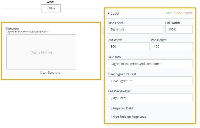
- Field Info– Its additional information for users to follow up.
- Clear Signature Text– To clear signature
- Pad Placeholder– Placeholder selector selects form elements with placeholder text, and let you style the placeholder text. The placeholder text is set with the placeholder attribute, which specifies a hint that describes the expected value of an input field.
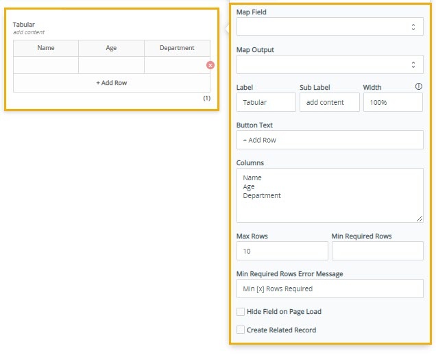
Tabular
A table is an arrangement of data in rows and columns, or possibly in a more complex structure called Tabular. A table is a chart that organizes information in rows and columns. Information presented in a table format is tabular.
- Button Text– Any text can be added here to add new rows to increase size of table if needed
Conditional Logic
Conditional logic relies on conditional statements. In logic, the conditional is defined to be true unless a true hypothesis leads to a false conclusion. The goal of conditional logic is to allow you to create smart powerful and useful forms that give you the best results. It has powerful built-in Conditional Logic. You can use it to:
- Show / Hide fields
- Send Emails to Recipients
- Redirect to Custom URL on Submit
- Trigger Integrations
- Set Value of Other Fields
Example 1:
Add a Date picker, a Checkbox, Submit button and a Custom Text field to your form. Make your form look like this:
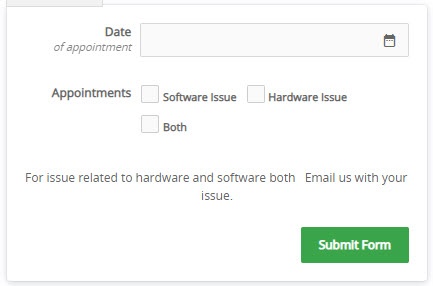
Now, go to Logic, and click on Add New Logic. Our job is to hide date field when user select both issues
So, our logic would look like this:
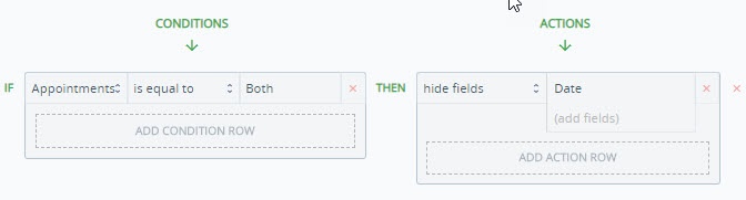
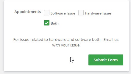
Now if user select both options he wont able to see date picker attribute.
Example 2:
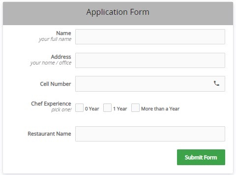
We are creating a web form to hire cooks for our new restaurant. We need applicant to fill out forms. All necessary information is given which needs to be filled by applicants. The applicant needs to fill out name, address, phone number and experience cooking in some restaurants if they had any experience. The form is shown below
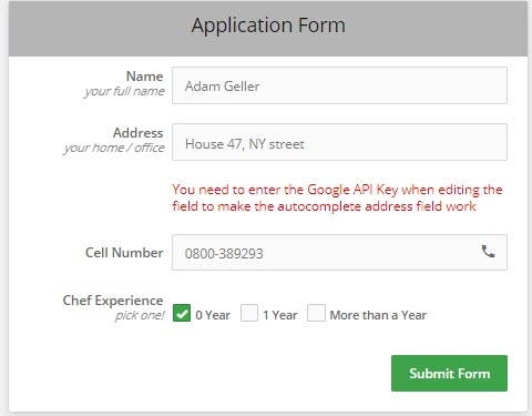
Now the question is how this conditional logic works if the applicant with zero year experience they don’t need to fill Restaurant name. We will develop test cases for each checkbox. Applicants with zero year experience of cooking wont have to fill Restaurant name. We will create conditions for each checkbox as shown below
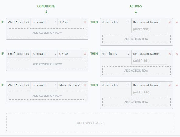
There is only one case which requires to hide restaurant name when you check the with 0 year experience it will automatically hide Restaurant Name field.
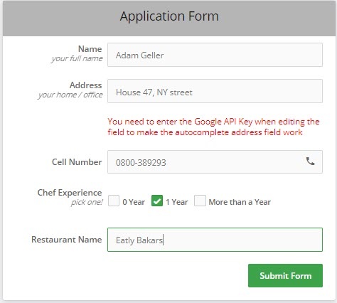
Now if applicants who choose 1 year experience will be filling restaurant name field such as
Survey
Fundamentally, a survey is a method of gathering information from a sample of people, traditionally with the intention of generalizing the results to a larger population. Surveys provide a critical source of data and insights for nearly everyone engaged in the information economy, from businesses and the media to government and academics.
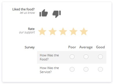
- Thumb Rating– A thumbs up/thumbs down system, on the other hand, is widely understood to imply that you are training an algorithm to know what you like.
- Star Rating– A star rating is a rating question that lets people rate a product or service with a number of stars. The number of stars can vary from 5.
- Choice Matrix– A Matrix question is a closed-ended question that asks respondents to evaluate one or more row items using the same set of column choices. A Rating Scale question, commonly known as a Like Scale, is a variation of the Matrix question where you can assign weights to each answer choice.